
Don't let bad UI kill your idea. Design can be learnt.
September 30, 2018
uidesign
indiedev
iosdev
design
selftaught
learning
Right people, enough with the…
- “I’m not a designer.”
- “I can never learn how to design.”
- “I don’t have the sense of colors.”
- “I need to hire someone to make this looks nice.”
… seriously stop telling yourself that!
Creativity isn’t a gift received by some lucky ones at birth, leaving the rest of us with no ability to create something beautiful. Sure some of us are drawn to these things earlier than others and they start practicing earlier which ultimately gives them more chance to improve their skills and become good at it. That said, that doesn’t mean everyone else is forever banned from trying to learn. It’s never too late to start.
This #AlwaysLearning philosophy runs in my family. My mother started horse riding at the age of 50, my sister taught herself how to write fantasy books at the age of 20 and I taught myself how to code without going to a Computer Science or Engineering School. Some might say it’s in the genes, but I don’t believe that either. You simply need real life examples to tell yourself that anything is possible and feed your eagerness to learn.
Anyways, back to design. A few years ago, I used to be of that same (false) opinion and I remember telling myself things like: “Design isn’t for me” or “I will never produce anything beautiful”.
But the thing is I’m highly risk averse and building apps (or websites) does require to have some amount of design done before coding everything.
So here, I had two (+1) options:
- Hire somebody to design everything for me
- Do it myself
- No design, beast mode I’ll code without visualizing anything beforehand
Honestly, if you have real ambitions with your products, don’t be that beast mode guy… Trust me, I tried, it doesn’t work and you end up losing tons of time.
When you are a bootstrapper and have next to no budget to invest in your side-projects, your success highly depends on your ability to work with the resources at hand. For most of us, time input will be much higher than money input (at least until we get our first success). When it comes to skills we don’t yet have, well … time can be traded for knowledge right? So learning is the way to go as always.
###Why is design so important?
John Doe: > Making money online… easy right: “Just build it and they will come …”
Ed:
Yes sure mate, I tried that … trust me that’s BS.
These days, competition is so intense that even if your product is solving a tricky problem many people face, it will still need to look appealing and catch people’s attention. You need to cut through the noise to build awareness and increase your chances to convert viewers into installers or visitors into customers.
If I give you these two apps, both worth 2$, which one would you go for?
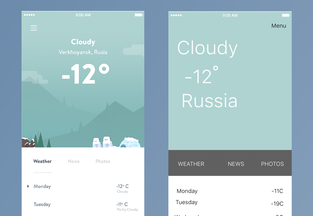 Two UI design versions for the same app
I think there is no room for debate here and we would all be drawn towards the left one as it just looks more polished.
There is a lot of psychology behind UI Design and as developers we often overlook this aspect by simply thinking that potential users/customers will love our product just because we spent so many hours working on it. The reality is that people generally don’t see / understand how much work was needed to build something and very few of them understand what’s really going on under the hood.
Instead they will most of the time look at your product and think either:
“Oh this looks nice and modern, there must have been tons of hours spent working on this?”
or …
“This looks like to was done in a rush, it’s probably not going to work well.”
They generally won’t care to know whether you followed best practice to build it or if your algorithms are the most performant ever. They need something that works and looks appealing so they know they’ll enjoy using it.
The way your product looks can either instantly enhanced its credibility or infuse a sense of doubt within your target audience, and you don’t want to latter.
So don’t let bad UI kill your idea.
Right ok, but we know that having a good looking UI is critical… that doesn’t help me come up with good designs does it?!
###Design can be learnt
Once again, there is no magic recipe but if you follow along I am confident I can convince you that you too can learn how to design.
To give you an idea of the progress I personally made in the last few years let’s take two examples.
1. Gluten Free World [iOS]
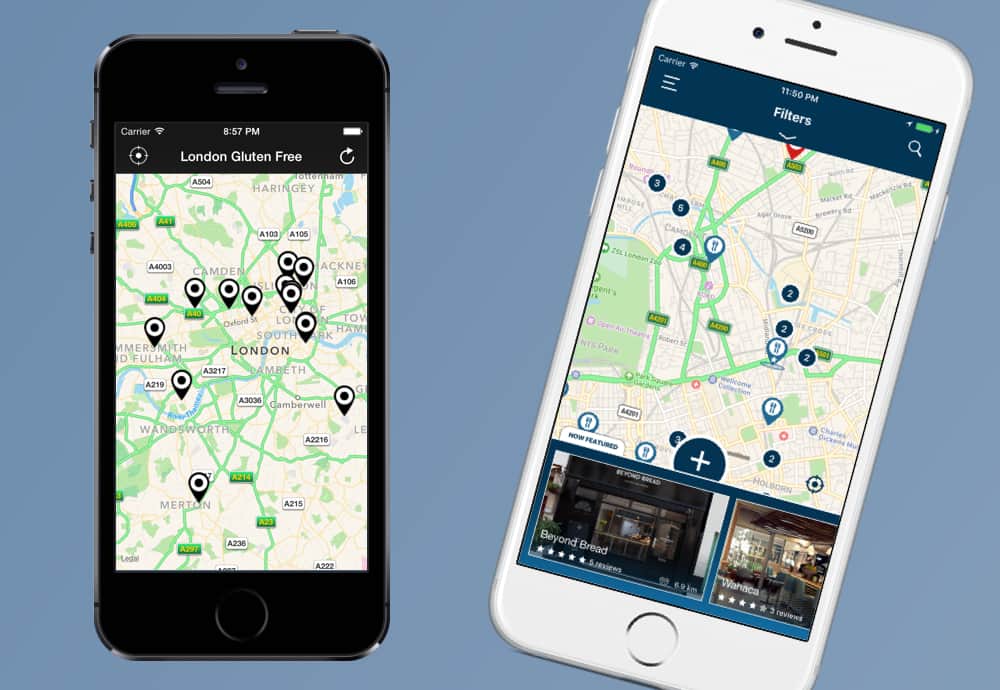 This is the first app I ever launched. It’s a map based experience listing gluten-free places around you. Looking at the design on the left makes me cringe a bit. On the right, the final version after four of five updates.
2. YT Tracker [iOS]
![]() This is the app I’m currently working on. It’s an analytics tools for YouTubers on iOS. On the left, its current UI and on the right the very first attempt to bring this idea to life.
This is the app I’m currently working on. It’s an analytics tools for YouTubers on iOS. On the left, its current UI and on the right the very first attempt to bring this idea to life.
I’m sure if some professional designers read this article and see these examples, they’ll find tons of flaws and ways to improve the final designs but coming from a business background with no prior creative or artistic experience, I think I can humbly say that I made progress throughout my journey.
3. User validation (YT Tracker)
 The validation also came from some users of my latest app (YT Tracker). They congratulated me on the UI which they find both simple and nice which makes it very enjoyable to interact with. That obviously made me super happy and acted as a true confidence builder.
To sum up:
I don’t think I can ever reach the level of a professional designer, simply because I don’t spend as much time practicing the craft of design as they do. That said, I’m sure I will continue to learn and make progress while working on my own apps / websites. And the good news is that you can do so too!
Self-taught designer? Who is in?
In this next section I’m going to go through tips, recommendations, useful resources etc… which hopefully can help you get better at designing UI to make your products succeed.
Start with the right mindset
If you’ve read my previous post which discussed the mindset to adopt to teach yourself how to code. The first two points will sounds familiar.
1. Patience is key
If you think you will just need to sit down and keep trying until you come up with something you find pretty, you are likely to be very disappointed. It won’t happen on day 1, probably not on day 30, maybe on day 90 if you keep at it regularly.
Forgive yourself to judge your work. It’s just not an option at this stage. You won’t like it because it won’t be “wow” and judging your work too early will only lead to losing motivation.
2. Perseverance
Keep at it, don’t stop trying. Your brain will constantly tell you that you will never manage to design something good but your brain is trying to protect you from doing things that are hard. It’s a basic self-protection mechanism. Don’t listen to your brain and keep trying.
3. Embrace ugliness
Whether you already tried to come up with good designs or you are planning to get started, you will ultimately find yourself looking at what you came up with and you’ll be like:
“This is so ugly, I have no idea how to make this look better, I’ll never get it. I cannot ship this.”
In all fairness, you are probably partly right. You came up with an ugly design. And that’s ok. We’ve all been there. Even the pros… But you are also wrong because you can definitely improve and thinking that your UI is bad shouldn’t prevent you from releasing your product. If you wait to get the perfect design, trust me you will never ship.
Change your mindset and tell yourself something like this instead:
“Right, ok this is ugly… it’s so ugly it’s almost funny… but at least it can’t get worst that this.”
IMPORTANT: Don’t delete these crappy designs, keep the files handy for later so you can look back at how much progress you’ve made. Trust me it will be worth it. I wish I had kept more of them. I unfortunately deleted a bunch of my very early designs.
4. Aim for 1% improvement at each session
You will say that improving by 1% is very hard to quantify and one again you are right. What I mean here is that you should aim for the smallest possible improvement every time you spend some time designing. There are different ways you can improve:
- Revamp an existing design you previously made and make a part of it looking nicer (i.e. tweaking the font size / weight can sometimes be enough to see a substantial difference)
- Learning a new technique on the tool you are using (i.e. finding good colors for a gradient) can also lead to noticeable improvements
Follow this secret recipe
The following steps sum up my very own approach to design. Since I’m not a designer, it’s very tricky for me to start from a blank page and expect to come up with something nice.
1. Clearly define what you need to build.
It’s hard enough to come up with something nice so do yourself a favor and make sure that whenever you start, you know exactly what you need to put on that screen / page. You can do that by doing a quick mind mapping of your user stories (what the user should be able to do on each screen) and how each screen / page will be used, or simple list down the elements you need to display (i.e one button for this, one gallery for that, one image here and 3 icons there).
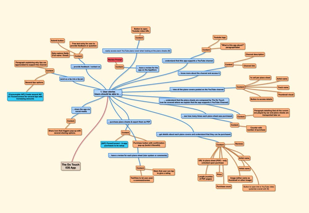
2. Find inspirations
As I said, starting from a blank page is the worst even though sometimes it feels empowering to know that you can literraly go in any direction. Finding inspirations is super helpful to easily find things you can copy / tweak / mix together and claim them as your own. Honestly it’s ok to go through phases like this until you find your own style.
Don’t bluntly copy another app or website but feed your own creativity with other people’s work. Sites like Pinterest & Dribble can be a huge help for this phase. Follow some #uidesign #iosdesign #webdesign hashtags on Instagram can also be quite useful.
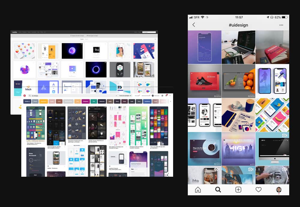 Design inspiration resources I like to use: Pinterest, Dribble & some hashtags on Instagram
3. Mood boarding
Grab all the design you found pretty cool during phase 2 and drop them in a Sketch file or your preferred UI design tool to create some kind of moodboard (a place where you can easily find a bunch of designs you know you find cool.
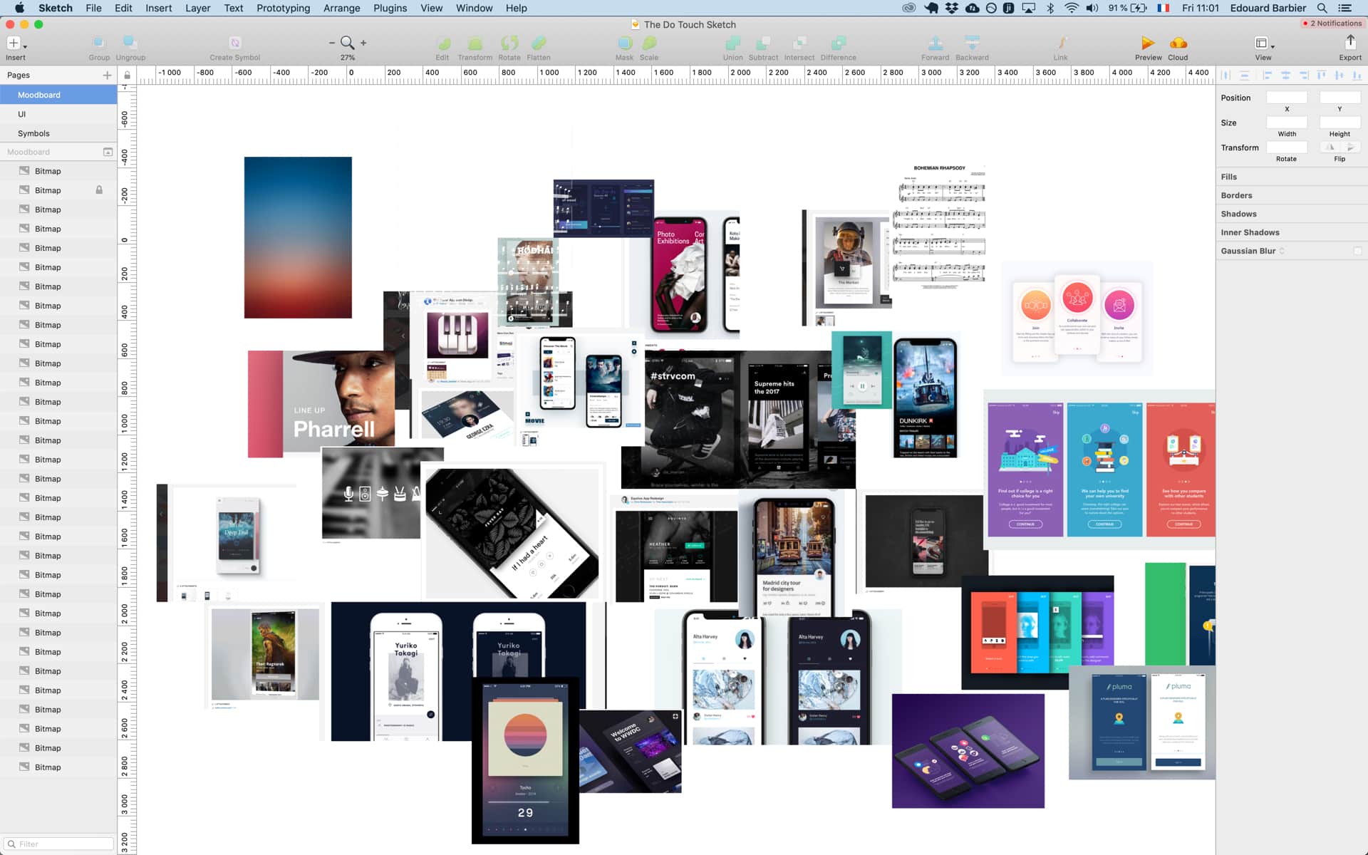 An example of mood board I had done for a previous project
4. Off you go, you’re up!
Once you have your mood board, look back at the list of things you need to put on your screen / page and try to find patterns in the things you added to your mood board. Once you see things you could reuse, train yourself to reproduce them with your UI Design tool. This is a great way to get better at simply using the tool itself and you will see that it’s motivating to see that you can start producing good looking designs. It’s ok if you do not manage to reproduce exactly what you found online. Remember we’re not here to point blank copy other people’s work. We are here to learn how to craft beautiful designs while working on our own products.
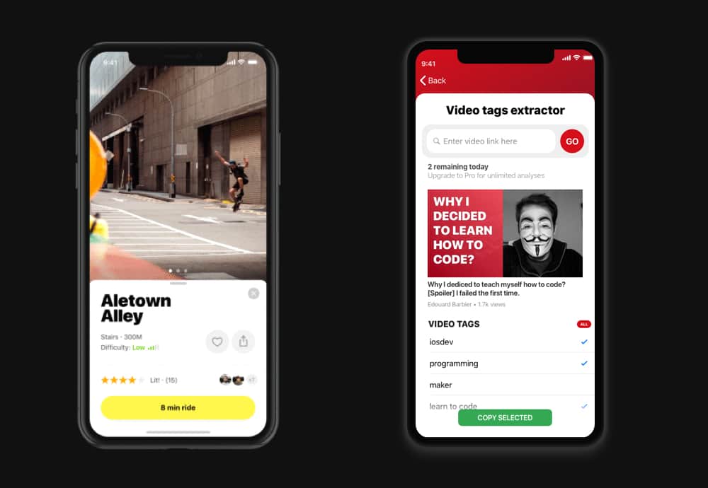 This is an example of design I found on Dribbble and used as an inspiration to come up with my completely different screen. You might say it doesn’t look the same at all and you would be right. These screens are similar in a way that they are both a cardView sliding up from the bottom of the screen with a bigger title at the top of the card and a call to action button at the bottom.
Wrapping it up
This sums up my approach to design. In my next article I’ll list all the resources I like to use and I’ll also give you practical tips I learnt along the way on my journey as an indie developer and designer.
I hope you found this post helpful. If you did, it would mean the world if you shared it with your network. Feel free to reach out if you have any question or feedback on this post, you can find me on Instagram or on Twitter.
If you want to find out about the apps I built, feel free to check my portfolio which can be viewed here.
Til next time, happy learning.
Cheers, Ed